While choosing the right colors for your website can be overwhelming, it can be done in three simple steps.
Step One: Review Perfect Customer & Current Logo/Branding
Here are some questions to ask yourself:
- Is my perfect customer male or female?
- What colors are currently used in my store?
- What colors are currently in my logo?
- What colors are currently on my other marketing materials?
- Do I have a branding and style guide for my company?
- What type of product am I selling?
- Which category does my website and product fit into best? Informational/Lots of Content, Corporate/Business, E-Commerce, Fashion, Design, Restaurant, Beauty, Creative Industries?
- Is my product an impulse buy or will my customer be doing research prior to the purchase?
- What emotion do I want my customer to feel?
Step Two: Choose 3-5 Main Colors Based on Answers in Step One
There are 3-5 main colors you need to consider when you are designing your website:
- Choosing 1 to 3 accent colors that will work with your brand
- Choosing a call to action color or dominant as your brand color
- Choosing the main background color to complete your design
- Choose a text color for dark backgrounds
- Choose a text color for light backgrounds
Accent Colors:
These are the main colors of your website. You will choose 1-3 that work with your brand, logo, and images you’ve planning on using.
Where you will use this color: they may be the subtitle, secondary buttons, information boxes, background color, secondary information, etc.
Call to Action or Dominant Color:
This will be a bright color that will stand out against both the background and your accent colors. Typically it is a shade of yellow, orange, blue, green, or red color.
Where you will use this color: Only use your call to action color in a limited number of places where you want your website visitors to paying attention to, or if you want your visitors to take certain actions. (such as call a phone number, fill in a contact form, sign up for a newsletter, action buttons, logo, menu tab, fill out important information, title & headlines, etc).
It should “pop” to really highlight where you want your visitors to focus on and what you want them to do next.
Background Color:
White or Neutral Background Color:
- Content Intensive Information Websites
- E-Commerce Websites
- Promoting a Service
Why?
The focus is on the content, portfolio, or products, rather than the design of the website. The background color is only a backdrop to help make the content more visible and readable.
Brand Color as Background Color:
- Corporate/Business Websites promoting a brand
Why?
This is because the color is closely tied to brand recognition & you want to build a strong brand identity.
Any Color as Background Color:
- Fashion
- Design
- Restaurant
- Beauty
- Creative Industries
Why?
The world is your oyster, highlight a color that makes sense with your imagery and brand.
If you are feeling overwhelmed with the number of choices, check out part three.
Text Color:
You will need one text color for light backgrounds, this will be a darker color. The second text color will be a light color and will be used with dark backgrounds.
The # 1 thing to consider when picking text colors for your website is READABILITY.
Here are some other color rules to consider:
Contrast
To make sure your content can be easily seen and read, you’ll need to create a sharp contrast between the color of the text and your site’s background.
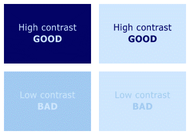
image credit: spaboom
Tip: For the longer paragraphs: stick with darker text to help your reader focus.
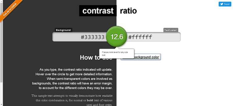
Contrast Tools: Check for the Readability of your text on the web.
Contrast Ratio: Simple type in the website color number to the background and a different color into the text section, it will give you a score of web content accessibility.
Webaim is another tool you can use.
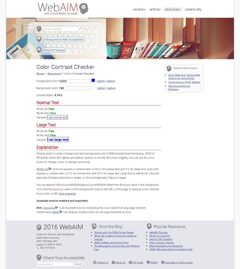
Web Content Accessibility Guidlines (WCAG) 2.o: Require level AA requires a contrast ratio of 4.5:1 for normal text and 3:1 for large text. Level AAA requires a contrast ratio of 7:1 for normal text and 4.5:1 for large text. Large text is defined as 14 point (typically 18.66px) and bold or larger, or 18 point (typically 24px) or larger. What this means, in a nutshell, is how easy is it to read your text on your website.
Harmony
Each element you add to your website should match and compliment all other elements.
Branding
There are no right or wrong colors so long as the colors you choose work in service of your website’s bigger goals.
Web Design Standards
If you see grey text on a form it signals something to be filled in, red text indicates an error or missing data and blue underlined text is a link you can click on. Use these standards as your guiding principles and get creative with the rest.
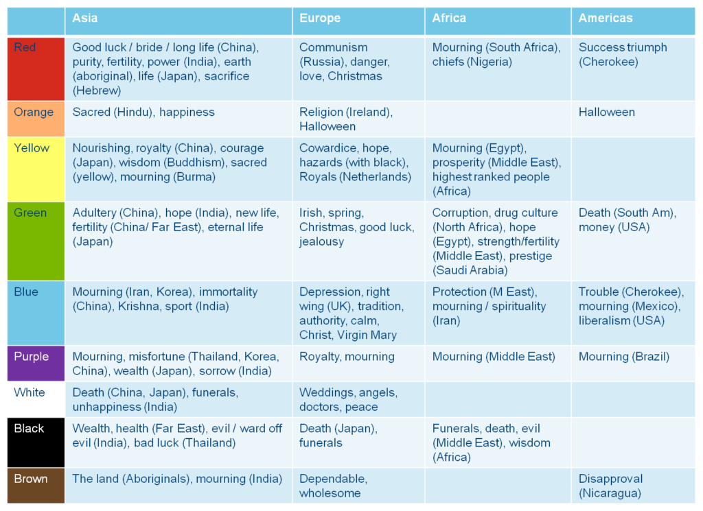
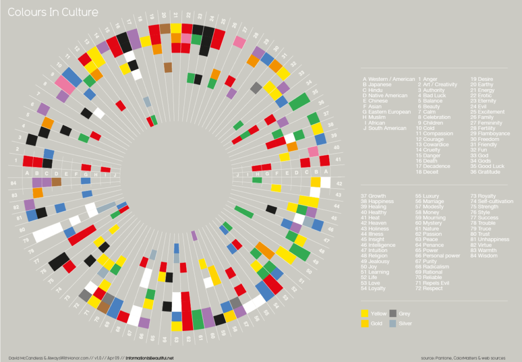
Cultural Norms
Different cultures have different relationships to colors. Use what makes sense for you and those who will be visiting your website. See the cultural color guides below. Click on the image to get a larger view.
Step Three: Refine the color combinations
Colors should not be chosen randomly. Instead, it should be a series of organized, objective, matching exercise:
(1) Matching your brand with the right dominant color; (2) matching the dominant color with accent colors using the Adobe tool; and finally (3) matching the background color with your dominant & accent colors. Here are some tools that can help you out.
https://color.adobe.com/explore/most-popular/?time=all Adobe Color CC
http://colorhunter.com/
The Mudcube Colour Sphere is a handy little color resource for designers in that it not only provides the hex numbers for each color; it also helps you to build up a color scheme from one chosen shade. If you’re unsure what color scheme you should be going for, Mudcube provides a selection of themes from a drop-down menu.
Mudcube Colour Sphere
09. Designspiration

At Designspiration, you can select up to five hues from a useful full-page palette, which gives you the chance to really see what colors you’re looking at. The site will then generate a display of all the images in its database with that color combination. The hex numbers are prominently displayed, and you can click on them individually. Images can be saved to your collections on the site.
http://colorsafe.co/
http://www.colorcombos.com/
Pick a template that feels right to your brand.
What is the Psychology of Color?
Color psychology is the study of hues as a determinant of human behavior. Marketers must be aware of the application of color in different media (e.g. print vs. web), as well as the varying meanings and emotions that a particular audience can assign to color. Even though there are attempts to classify consumer responses to different colors, everyone perceives color differently. The physiological and emotional effect of color in each person is influenced by several factors such as past experiences, culture, religion, natural environment, gender, race, and nationality. When making color decisions, it is important to determine the target audience in order to convey the right message. Color decisions can influence both direct messages and secondary brand values and attributes in any communication. Color should be carefully selected to align with the key message and emotions being conveyed in a piece.[16]
Research on the effects of color on product preference and marketing shows that product color could affect consumer preference and hence purchasing culture. Most results show that it is not a specific color that attracts all audiences, but that certain colors are deemed appropriate for certain products.[17]